Top Principles to Keep in Mind For a Good Mobile Website Design
With a surge in smartphone users, businesses realize the need for a good mobile website design. An attractive mobile web design is a must for a business to stay relevant and compete with other companies. And google deciding to consider mobile-friendliness for influencing search engine rankings is like the cherry on the top.
Even though mobile websites overtook their desktop counterpart, there is a significant difference between people’s behavior on mobile and desktop websites. And few businesses are paying attention to this difference when creating a mobile website design. Stay with us if you want to offer your visitors a great mobile website design experience. You will learn about the top principles of design for a responsive website design.
What is Mobile Website Design?
A mobile web design is a web page created and optimized for portable devices, smartphones, and tablets. The website design should be responsive to ensure a good experience for visitors. A responsive website design can adapt to the screen size on which it’s viewed. In mobile websites, the elements of a website are stacked on top of each other in one long column. The size of the buttons is kept bigger, making it easy to tap them. And the text is larger concerning the page, making it easier to read.

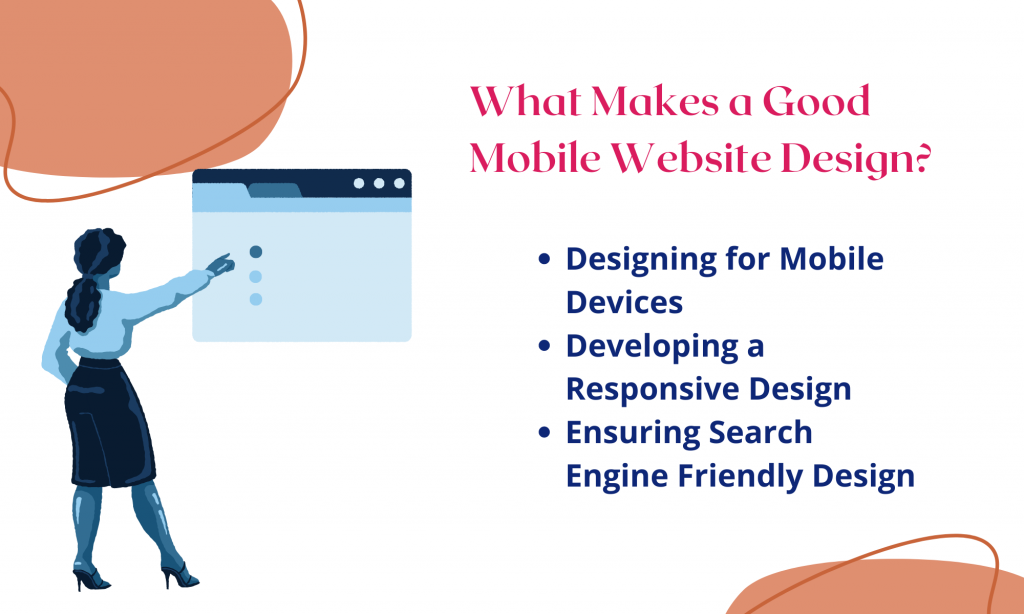
Mobile web design is optimizing the web experience for mobile users. When creating a website, keep the following design features in mind:
-
Design for Mobile Devices
Earlier, the designers were optimizing websites for desktop users only. But, with the increase in smartphones, browsing habits are changing. This change prompts the designers to follow a mobile-first approach. This approach means that the designers should first optimize the site for the smallest possible screen. After optimizing for a smaller screen, they should start optimizing for larger screens like tablets or desktops.
-
Responsive Design for Mobile Devices
Responsive layout changes itself and adapts the size of the user’s device. It’s necessary to design a responsive layout showing maximum information on the smallest screen. However, you should not make the website look cluttered when trying to show the information to users.
-
Search Engine Friendly Design
Even if your website has the most intriguing content or features, users will be unable to locate it in search results. Google provides a tool called Mobile-Friendly Test that helps you to determine whether your website is mobile-friendly. Hence, you should also focus on developing a search engine-friendly design.
How to Create a Mobile Website?
Generally, the mobile website design process originates with user and market research. The product team gathers information about the target audience, analyzes their needs and wants, and uses it to provide a solution.
After figuring out the solution, the process of creating a mobile web design UI initializes with prototyping. The prototyping process includes creating both low-accuracy and high-accuracy prototypes. First, the developers and designers will prepare a less-accurate prototype that will provide information on single pages of the website. The product team will then present the information to the organization.
After this step, they convert this prototype into a highly-accurate design by adding actual content and imagery. It will help to approve the mobile website design with real users. As soon as the prototype gets approved, the team starts working to create the fully-fledged working website. Developers use frameworks like Django, Bootstrap, Flask, Angular, React, or website builders such as Wix, Squarespace, GoDaddy, Weebly, Zyro, etc.

Principles of Design: The Key To An Effective Web Design
Smartphone users have a goal-oriented mindset, and they come to achieve their goals when they visit a website. So, the users expect an effective web design. And to create such design, you must follow these principles of web design:
-
Establish a robust informational hierarchy
As told earlier, mobile users are goal-oriented and expect everything to be found as quickly as possible. They don’t read each word; instead, they skim the page. Hence, an effective web design should be easily skimmable. Finding the information should be easy and take less time for the users. As you create a mobile website, bear the following points in mind:
- Provide that information only that users need to achieve their goal.
- Users should be able to locate what they are searching for as soon as they enter the website.
- Design website navigation in a way that can help users spot the menu. Utilize white space effectively to separate content and help users differentiate.
-
Make Use of Simple Page Layouts
Your user’s attention is a limited resource, and you should use it efficiently. If you use a lot of elements on a small screen, it will confuse your users. , Hence, you need to prioritize a simple layout as they work better on small screens. You can follow these points to hold user attention:
- Rely on a single-column layout on mobile because multiple columns will clutter the page and make it more complicated for users to grasp information.
- Mobile users are used to scrolling vertically. That’s why it is not advisable to use horizontal scrolling. Avoid including horizontal scrolls in your mobile website design as they lead to poor UX and are not convenient for users.
- Follow the subtle approach to form a clean layout. Eliminate elements without actual use so users can enjoy an uncluttered UI/UX.
-
Make The Text Readable And Use Large Touch Targets
A mobile website design needs to have easier readability. The user should be able to read easily because the text communicates the information. Consider these points to ensure good readability:
- To make it simpler to navigate, pick taller and naturally structured fonts with some white space between the letters. Most device manufacturers recommend the following fonts: Arial, Helvetica, Courier, Georgia, Times New Roman, and Trebuchet MS.
- For simple reading, choose font colors that stand out from your background colors. To make text accessible to readers, aim for WCAG 2.0 level AA.
- Consider the typeface’s speed as you select it. Remember that fonts impact load times, which is crucial for mobile websites. To keep page load time as fast as possible, use a limited number of typefaces.
Reduce User Efforts
Though it’s crucial to include forms, ensure users don’t spend too much time filling out forms. Entering lengthy details irritates the users and tests their patience. Follow these guidelines while designing forms:
- Ask the users to fill in only the crucial information. This will reduce the user’s effort when they fill out forms.
- Provide a feature to auto-fill to enter details like email or shipping address. It will minimize the user’s efforts.
- Add inline validation to the forms. It will indicate the incorrect details in real-time as soon as the user inputs data. It’s a good feature as it will save users time.
-
Optimize Page Speed of Mobile Websites
Users do care about the loading speed of the page. If it takes the page a long time to load, then there’s a high risk that users will give up on the website. Heavy images, videos, and animations can affect loading speed. Hence, measuring page speed and removing any elements slowing the page is highly advisable.
-
Maintain Consistency in The Visuals And Functions of Mobile And Desktop
Today businesses are present on both desktop and mobile devices. But, their mobile websites and desktop websites are inconsistent, making it harder for users to recognize the brand on different platforms. Thus, we recommend keeping your visuals and functionality consistent on desktops and mobiles.
-
Permit Users to Complete Pending Tasks on Different Devices
It is common for users to begin a task on mobile but finish it on desktop. A typical example is purchasing products from an e-commerce website after browsing them on a mobile device. As a result, offering a feature that saves progress and allows users to resume where they left off is a fantastic idea. It saves users the trouble of repeating the entire process from the beginning.
Future of Mobile Website Design
Businesses are quickly switching to mobile devices with the number of users visiting mobile websites instead of desktop websites. But, they need to create a mobile website optimized for mobile devices. A mobile-friendly web design can enhance the user experience. There is a difference in the behavior of users on desktops and mobiles. So, businesses should keep in mind the behavioral difference of users and create a good website for smartphones.
To help the businesses, we explained the basics of mobile website design, the design process, and the principles of website design. Although we defined the 7 fundamental principles to create an effective web design, it’s not necessary to follow all of them rigorously. Utilize those principles which work for your website. Ultimately, the design is not only for designers. It’s for users as well. Your mobile website design should be helpful to users and fulfill their goals.


